Responsive iShare
5.2.6+
Overview
The responsive design is an alternative display mode for iShare which allows the site to respond to the size and orientation of the device upon which it is being displayed. It manages this by changing the number and width of columns and whether it should use tabs or buttons.
While this could be applied to a non-responsive site, the best results are gained by using it with a similarly-designed responsive site. This way, the whole site fluidly displays on the device.
It would be nice to be able to make the whole process automated, but as the “breakpoints” for a site are added by the creator of the site, iShare needs to match these, and therefore, there is always going to be a level of manual customisation to be made to the CSS. With this in mind, we have tried to make the whole deployment process as easy as possible.
The way that the responsive design works is to create a standard view for the lowest resolution, and then iteratively override that as the width increases. So rather than having to have entirely different CSS for each width, we have a single main block for the lowest resolution, then a smaller overriding block for each different breakpoint.
Currently, we have a single breakpoint, smaller than this and iShare goes into single-column mode, larger than this and it goes into multi-column mode. The number of columns that are displayed depends on how much space is available. Also, the columns may appear to be lop-sided, but this is due to the fact that they are dynamically built, and it’s always possible to reorder the panels in Studio.
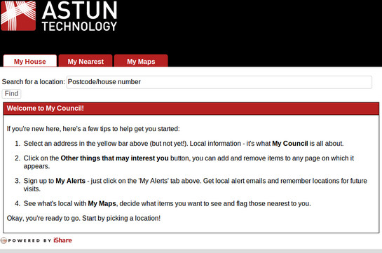
Responsive iShare displayed on a larger screen showing tabs.

Responsive iShare displayed on a smaller screen showing buttons.
Installation Files
From version 5.2.6 of iShare the following directories and files are included in the web site for the responsive design [...\WebApps\Web\ folder].
atMyResponsiveCouncil.aspx
This is the file that is requested by the user for the site. It includes references to the template file.
_atResponsiveTemplate.html
This is the template file that includes the token for the site. This should also include references to the responsive CSS which should appear just before the </head> and the JavaScript file which should appear just before the </body>.
/css/Responsive/Normalize.css
This is a CSS file which has been developed to standardise CSS across all major browsers. (http://necolas.github.io/normalize.css/)
/css/Responsive/Responsive.css
This is the main responsive CSS file which uses media queries to change the styling at different widths.
/custom.example/css/responsive/responsiveoverrides.css
This is an override CSS file which should be the last one requested in the template file. It is used to override any CSS in the main site which is breaking our responsive designs. If none of the customer’s CSS is clashing with ours, then it’s probably not necessary to include this file.
/js/ResponsiveDesign.js
This is the JavaScript file which handles the re-writing of the columns depending on the current width.
Please refer to the Implementation topic for further details.